Happy Checkout + Responsive Checkout = Soulmates November 9, 2014 19:00
We are so incredibly excited for the Shopify Responsive checkout – we wrote about it recently in case you missed it.
We’re happy to announce that we’ve deployed support for the responsive checkout in our Happy Checkout app. You can now enable the responsive checkout if you upgrade your checkout via your Shopify dashboard! Once you do, you’ll want to take a couple of steps.
First, set up your new checkout options in your Shopify admin. You’ll find them under Themes > Customize Themes > Checkout:
Now we’ve got to tell Happy Checkout you’re using the new checkout. Unfortunately, there’s no way for us to automatically detect this. We wanted to make sure that both sites using the old checkout and the new responsive design would have no breaks or issues, so we’ve asked you to tell us if you’re using the responsive checkout. You can enable it from your Happy Checkout dashboard:
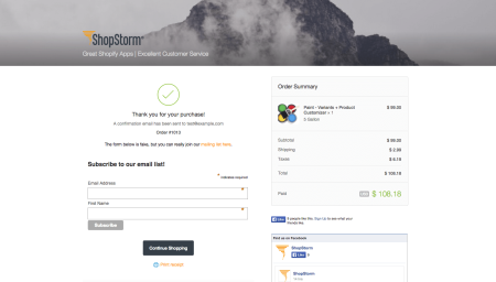
Now you’re set! You can probably remove some CSS as well, as you no longer have to add background colors or logos manually. These are now pulled in from the new Shopify checkout settings. I’ve set a banner image, logo, and tagline from within my Shopify settings:
My colors are also pulled into the Happy Checkout styling. This is designed to make it easier for our customers to style the thank you page with the much needed additions to the Shopify checkout page.
Want to see it in action? Here’s our sample checkout.
CSS Tips
If you’ve previously added your own CSS, you may need to change some of it after upgrading your checkout. Here’s a quick guide on how to do so:
- You should now use the theme “Logo” option to add a logo. You can use the
.shop__logoelement to add additional styling as needed. - The
#greetingelement is now gone. Please style the.shop__descelement instead. This is the original tagline provided by your Shopify theme, which can be overridden with your Greeting setting. - There are smaller style changes to the modules as well. Instead of
.moduleclass, use the new.he-moduleclass for styling. To style a specific module, use its appropriate class, like.he-module-facebook.
If you’re still using the old checkout, please note that updating anything will cause our new CSS to take effect. Here are some changes we’ve had to make to the CSS that you’ll still have to adjust if using the older checkout template:
- The
#greetingelement is now gone. Please style the#taglineelement instead. This is the original tagline provided by your theme, which can be overridden with your Greeting setting. - If you want to add a logo to your checkout page, use the
#logoelement. This is the official, Shopify-recommended way to do it.
Now go hit that update button and enjoy a beautiful, personalized checkout experience!
The post Happy Checkout + Responsive Checkout = Soulmates appeared first on ShopStorm.


